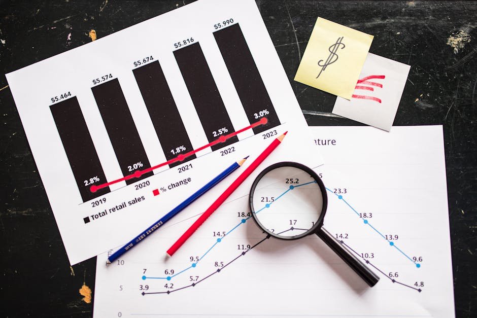
Burndown Charts Analysis: Visualizing Team Progress
In today’s fast-paced work environment, managing team progress and ensuring timely completion of projects is crucial. One of the most effective tools for visualizing team progress is the burndown chart. This article will delve into the intricacies of burndown charts, providing an in-depth analysis of their benefits, how they work, and practical tips for maximizing their potential.
What is a Burndown Chart?
A burndown chart is a graphical representation that illustrates the amount of work remaining versus time. It is often used in agile project management to track progress over a sprint or the entirety of a project. By displaying the ideal progress line alongside the actual progress line, teams can easily see whether they are on track to complete their tasks.
The Components of a Burndown Chart
The typical burndown chart includes two main axes: the vertical axis represents the amount of work remaining, often measured in story points or tasks, while the horizontal axis represents the time elapsed. The chart consists of:
- Ideal Work Line: This is a straight line that represents the ideal pace of completing work.
- Actual Work Line: This line shows the actual progress of work done over time.
Benefits of Using Burndown Charts
Burndown charts offer numerous benefits for teams and project managers:
Real-Time Progress Tracking
Burndown charts provide a visual representation of progress in real time. This allows teams to quickly identify if they are veering off course and take corrective action if necessary.
Enhanced Team Communication
With a shared visual representation of progress, team members can communicate more effectively about project status, potential roadblocks, and necessary adjustments. This fosters a collaborative environment where everyone is on the same page.
Improved Planning and Forecasting
By analyzing burndown charts from previous sprints or projects, teams can better estimate future work and set more realistic deadlines. This historical data helps in forecasting project completion and managing stakeholder expectations.
How to Create an Effective Burndown Chart
Creating a burndown chart involves several steps, each crucial for ensuring an accurate representation of progress:
Define Your Scope
Before creating a burndown chart, it is essential to define the scope of the project or sprint. Clearly outline the tasks to be completed and assign a value to each task, typically using story points or hours.
Set a Time Frame
Determine the time frame for the burndown chart. This could be the duration of a sprint or the entire project timeline. Having a clear start and end date is essential for tracking progress accurately.
Update Regularly
For a burndown chart to be effective, it needs to be updated regularly with the amount of work completed. This might mean updating the chart daily or after each significant task completion.
Common Pitfalls and How to Avoid Them
While burndown charts are powerful tools, there are common mistakes that can undermine their effectiveness:
Inaccurate Estimation
One of the most common pitfalls is inaccurate task estimation. If the story points or hours assigned to tasks are not realistic, the burndown chart will not accurately reflect progress. Teams should strive for realistic estimations by leveraging past data and team input.
Neglecting Updates
A burndown chart is only as good as its data. Failure to update the chart regularly can result in an inaccurate portrayal of progress. Teams should establish a routine for updating the chart, ensuring it remains a reliable tool for decision-making.
Actionable Tips for Maximizing Burndown Chart Use
To make the most out of burndown charts, consider the following actionable tips:
Engage the Entire Team
Ensure that all team members understand how to read and interpret the burndown chart. This ensures that everyone can contribute to discussions about progress and potential adjustments.
Utilize Software Tools
There are numerous software tools available that can help automate the creation and updating of burndown charts. Tools like Jira, Trello, and Asana offer built-in functionalities that can save time and reduce human error.
Review and Reflect
At the end of each sprint or project, review the burndown chart to identify patterns or recurring issues. Use this data to improve future planning and execution. Reflecting on both successes and failures encourages continuous improvement.
Conclusion
Burndown charts are invaluable tools for teams looking to manage their progress effectively. By providing a visual representation of work completed versus work remaining, they help teams stay on track and communicate effectively. To maximize their potential, teams should focus on accurate task estimation, regular updates, and utilizing available software tools. By doing so, teams can ensure that burndown charts become a cornerstone of their project management strategy, leading to successful project completions and improved team dynamics.
As you integrate burndown charts into your workflow, remember that their true power lies in the insights they provide and the actions you take based on those insights. Whether you’re new to agile methodologies or a seasoned pro, mastering burndown charts can significantly enhance your team’s performance.


